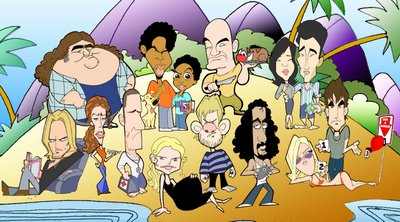
This is the newly revised version of the LOST caricature. I wanted a more flat look, so I removed all of the drop and inner shadows. I also made a new John Locke, the original looked a little too "Brando-esque" (thanks Keelan!) This was meant to reflect the cast of the first season, although I may add a few of the second season characters. 


2 comments:
Very nice Kenny. So simple and yet distinct. John Locke looks alot better. I could totally see that in an ad for TV Guide.
Yeah man - I dig this. Great Hurley.
Post a Comment